Saturday, 25 April 2009

Adrianne Lobel


These stage designs by Adrianne Lobel remind me of Josef Albers' paintings. I dont know if they were done for a play or ballet of what, but i think the simplicity really works in creating alot of space and quite a calm atmosphere. Iv never been a fan of the square paintings that Albers did but i think its quite sucessful when applied to a 3d design.


Wednesday, 22 April 2009

Design Industry and the Recession

To those who believe what the press tells them, the UK economy is on a downward spiral, and we'l be paying for the mistakes of our financial sector for generations to come. As someone who is about to graduate in the depths of what is alledgedly the worst recession for 70 years, im a little concerned about my prospects. This report examines how the recession has affected the design industry, what can be learned from it, and ultimately how can someone in my situation make the most of it?

My inspiration for writing on this subject comes from the fact that all the scaremongering from the media contradicts quite dramatically with what my industry contacts have said. In general, the illustrators that i have contacted have noticed little difference in workload over the past 9 months, but have become wary of turning down any work. However one concern raised by Canadian illustrator Carl Wiens that could seriously affect the illustration industry is the fact that, if newspapers continue losing alot of money, to the point where they go out of business, he would lose alot of important, regular clients. He also added that some clients are taking slightly longer to part with their money.

In the UK, the last year has seen salaries in the design sector drop by up to 10%. As dramatic as this sounds, the significant and probably excessive rises in previous years realistically makes this only a minor concern. What i did find alarming, however, is that as of the begining of 2009, it is reported that 60 small businesses were going out of business every day. Whether this is due to the economic climate, poor business management i dont know, but this loss of competition provides an excellent opportunity for the expansion of new enterprises. Biddy Moroney, an illustrator based in Australia, is involved with two relatively new businesses and has been lucky enough to see them grow over recent months.

The reduction in illustration work is currently making times hard for freelancers, especially those who are not yet established. Its interesting that the first signs of economic recovery for the design sector are predicted to come from an increase in the commisioning of freelance work; a lack of confidence in the market means limited availability of permanent positions, but as clients begin to regain their faith and business improves, they are likely to employ designers on a freelance basis first to avoid having to pay out salaries. Another group likely to struggle this year is graduates. During unstable periods, companies will be less willing to take risks, and place far greater value on experience and those with a proven track record of reliability. The value of a good work experience placement cannot be underestimated.

The best placed to ride out this economic downturn are those involved in the internet and digital markets. This is the only industry to have continued growing through the last quarter of 2008, though at a reduced rate, and 2009 is predicted to be the first year when companies expenditure online will overtake TV advertising. The fact that businesses are still spending money in this area shows the strength of this growing market; "technology needs to be concieved, designed, packaged and promoted". (Exton, Vision 2009. Design Week)

Though some areas of design will struggle and some business will inevitably lose money, we cannot afford to focus too hard on what is at least partially media driven gloom. The last economic downturn in 2001 saw well run companies emerge stronger, with lessons learnt. Attick studios in New York was forced to make half its staff redundant, a difficult decision at the time for owner James Sommerville - but one that resulted in Attick going from being "a sprawling organization to a more focussed studio". Another benefit gained from this last recession was an increase in the quality of design work; fewer jobs made tough competition for illustrators, basically forcing everyone to be more creative and produce better designs, which can only be a good thing.

This will inevitably not be the last recession. As someone who is about to enter the design industry, i should take notice of who is riding out the downturn most effectively and why. Apart from the digital industry becoming increasingly important, it is those capable of working in several disciplines who are least likely to be caught out when one area of design suffers financially. "Those working in overseas markets will be especially well placed to weather the downturn", says Anna Richardson of Design Week, a sentiment echoed by James Sommerville. He feels that designers pitching for work outside their own country have an immediate advantage over any local designers simply because they will have a slightly different outlook and their work is likely to stand out. As the Asian markets begin to compete with the US for dominance, designers would do well to look there for work.

So although the next year is predicted to be a tough one for most areas of the design industry, i feel that those who are capable of working in several disciplines and are creative in terms of design as well as the way they market themselves, will always be able to find work.

Andrew Pavitt

Andrew Pavitt came in today to talk to us about the running of his studio Big Orange, and the possibility of an internship there later in the year. The studio is based in what is now a very fashionable area of London, i was really suprised to learn that his rent is only £200 a month, and that you can easily rent space in a crappy run down warehouse for as little as £50 a month; id thought the idea of having a studio as totally unnatainable at this point. A good location is becoming less important due to websites and email, but if you are out in the middle of nowhere, youll have to work that little bit harder to gain notoriety. The 8 illustrators and graphic designers from Big Orange share their studio with the AOI. This provides the advantage of free membership, and legal advice whenever they need it. He said the main advantage of working in a studio of this size is being able to bounce ideas off other artists, which helps to erase any doubts or insecurites in your own mind. Everyone puts together for essential expenses such as computers, phones, cleaning etc. He recommended that when looking for a studio, pick one thats open 24hours, as its really important to be flexible for tight deadlines. Alot of clients, particularly big American ones, think theyre doing you a favour in commisioning an illustration, and will therefore expect the work done overnight if necessary, completely disregarding timezones.
The only disadvantage he could think of is is a social one: the dynamic of a studio depends on the people working there, for example someones taste in music or just a clash of personalities can create an unpleasant atmosphere. This is why most studios will prefer someone who fits in socially rather than someone who has a similar working style.
Later in the afternoon, i was able to show Andy my Fear and Loathing project, which he was really positive about, he said it looked like im enjoying doing it and that my works quite edgy and stands out alot. Which is kind of what im going for. And he loved the bat and lizard photos. He couldnt offer much advice in terms of the set designs im doing, as its totally out of his area, but suggested i contact a few places over summer and see if i can get either work experience or a job as an assistant to someone working in the industry. This is how he started work as a painter years ago, he warned that the pay is likely to be very low but that the experience is invaluable if its something you really wanna do.
When i mentioned that this projects really strayed away from illustration, he suggested that i could possibly use some of the photos iv taken and collage them, or put together abstract bits of them, maybe working over them or something. I might try this. But also i like the way its going...

Tuesday, 21 April 2009

Quay Brothers Animations

Eleanor recomended that i look at the work of Steven and Timothy Quay. Iv just watched an interview with them, i think theyre twins and are seriously wierd, the same clothes and mad professor haircuts etc.... i love their work though, most of its so sinister and twisted, they seem to have a thing about dolls with no eyes and setting them on fire, but not in an excessively gory and trying to shock kind of way, its really dark and atmostpheric, and they use music effectively aswell, almost like a dialogue in itself, adding to the sense of drama. The 1st link above was done for the BBC, and the idiots rejected it, i cant understand how, its a 3d paper sculpture animation, really quite elegant.

Monday, 20 April 2009

3D Text


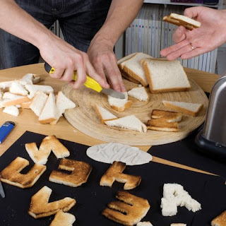
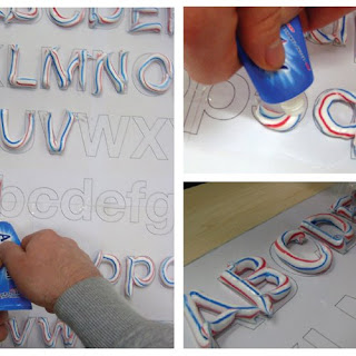
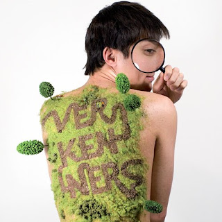
In the weekly email i get off design week, theres this article i found pretty interesting; about how before the digital age, 'type was something physical, chunks of metal you could throw like a rock' etc. And theres various contemporary designers who are keen to make text 3d again, give it some substance and dimension. From top: Vladimir and Maxim Loginov, Maarten Dullemeijer.

Another exhibition i dont have time to go to


Iv read in the latest issue of design week about an exhibition thats just opened at the Victoria and Albert museum, London, showing the history of British stage design and theatrical sets / costumes. It covers 18th century theatre to modern rock concerts stage set ups, the image above is Pete Townsends guitar that he smashed on stage, this image is what drew me to the article, it looks remarkably like a piece im working on for my major project but i swear i did not rob the idea from here!! or anywhere else. But next time im in London ill make an effort to get to this one, could be really interesting.

More Patrick Thomas


Another really simple but effective design by Patrick Thomas, the red fist of communism crushing the capitalist dollar. I love it, think it could look cool in 3D

Comparison Report


Iv chosen to compare the processes and practices of two artists working in very different fields; Patrick Thomas, an illustrator / graphic designer based in Barcelona, and Luise Vormittag, co-founder of Container Plus, a company which focuses on such diverse elements as 3d and set design, fashion photography and street art.

Thomas’s main client is the economy supplement from a Spanish newspaper, basically their equivalent to the Guardian here, for which he produces weekly cover designs and editorials. His illustrations tend to be based around a strong concept, and are very simple and direct in the way they communicate. The nature of editorial work dictates that this is the case, as most readers will only glance at an image; therefore its meaning must be bold and immediately obvious. The piece above is a good example of this clarity, it illustrates an article describing the differences between France and Germany. His ability to work in this way stems directly from his interest in the bold imagery of the punk and pop art movements of the 60s and 70s.

The vast majority of these illustrations have a strong political theme behind them, which is obviously dictated by the article, but it is something that I feel Thomas has a genuine interest in. I felt that his strongest piece was the iconic image of Che Guevara screenprinted, his face made up of corporate logos and symbols of capitalism. This appropriation of images is something that Thomas enjoys; the challenge of putting an original slant on an existing image in order to make it his own. His interest in using clichés also helps to make his images obvious in their communication. The short timescale to which he has to work seems fairly typical of editorial jobs; most images are produced in only a few hours, which informs the necessity to develop a quick way of working.

The relatively low pay of editorial work makes it essential to be prolific. The prospect of a reliable, regular job, plus the exposure that editorial work gives you as an artist seems quite attractive to me; however I think that my 3D style is too time consuming; I simply would not be able to compete with someone who uses Photoshop and can produce an image in a couple of hours. I also feel that the constraints placed on an illustrator by a publication such as a newspaper mean that there is little room for experimentation or development of style, which I personally would find pretty boring.

As an editorial illustrator, Patrick Thomas works alone, though shares his studio with other artists. Luise Vormittag works as part of a small company, and is therefore constantly collaborating with others. They describe their work as ‘hand rendered artwork, set design and photography’, and have an extensive and varied client list including Topshop, Bitburger, MTV, Selfridges, and Volkswagen. The influence of Art Noveau is combined with contemporary art and fashion, and even magazines such as Heat provide inspiration. I think that this ability to work within several disciplines and keep their work up to date with current trends makes it edgy, which in such a competitive world is a major strongpoint for the company, as there will always be a market for their work. Unlike the simplicity favoured by Patrick Thomas, Vormittag’s work is quite elegant and contains a lot of hidden detail. She uses Photoshop, but a lot of her work is hand drawn or 3d.

Both practitioners use self initiated projects as a way of developing ideas and style, and producing promotional material. Patrick Thomas has produced postcards of his screen prints, and he recently held an exhibition in which his work was appropriately displayed in a newspaper format. Self initiated projects are particularly important to Container Plus, due to the necessity of having a wide variety of fresh promotional material to use when pitching for jobs. I find the idea of working in several different disciplines very exciting, as no project would be the same and it would give my style and skills the chance to be constantly evolving. I also like the idea of being part of a team, as the necessary evils that come with running a creative business, such as admin and promotion, can be split, taking the pressure off the individual. However, I recognise the risks of being in an industry where you are pitching for the majority of your work, and the level of confidence, determination and self motivation required in order to succeed. In a way I think I can be too laid back at times. Another downside to this way of working is the cost of hiring other people such as photographers, when there is no guarantee of any income at the end of the project. If I decide to follow this path, I would be keen to learn these skills for myself.

Whether I work alone or collaborate, a lesson I can take from both practitioners is the importance of not being too insular as a designer, as a lot of inspiration can come from other people; also I think being around others in a working environment is good for motivation.

I found the visits to both Luise’s and Patrick’s studios very worthwhile; the idea of set and stage design had not occurred to me until visiting Container Plus in London. A piece from a self initiated project called ‘Footwear Fairytales’ (above) changed the way I work; rather than struggling to combine hand made and digital work, I have found more success in creating a whole image in 3D and photographing them. What I found most inspiring about visiting Patrick Thomas’s studio in Barcelona was the idea of working abroad, as I love experiencing other cultures and find it easy to pick up foreign languages.

While Patrick’s and Luise’s work differs greatly in terms of style, industry, and subject matter, I feel that they share similar attitudes in terms of loving what they do and having the confidence to do it.

Sunday, 19 April 2009

Set Design


Since visiting the Container Plus studio in London, iv become interested in the of working in set design. My major project has unintentionally been going this way, and talking to Luise Vormittag has, in my mind, opened up a few possibilities for my work. The idea had never occured to me before, id assosiated set design with some really wierd people doing theatre and earning fuck all money from it. But seeing some of the projects that Container Plus have worked on such as promotional events and launches for companies such as Topshop and MTV, has really inspired me. And then from having looked online, iv realized the opportunities for set design within the TV industry. I remember a show on MTV years ago called headbangers ball, Rob Zombie did the set for that, it was some mental trippy nightmare scene that i cant find to use as an example here, it was mint though.


So basically iv become pretty interested in this, as i think that model making is a skill iv definetly got, and the more iv got into this over the past year, the more iv been kind of dissollusioned , not knowing where my work could fit in, or what it even has to do with illustration anyway. I need to do alot more reasearch into the idea, but for now heres a few examples of some stuff i like, by a company called 3D Creations. Theyve done stage designs for Iron Maiden, who i personally think are shit, but would be an amazing job to have anyway. Other stuff includes sets for museum exhibits, corporate events and launches, channel 4 sets and yes, alot of theatre.

Wednesday, 15 April 2009

Lizards Animation

Iv done various little tests for the different parts of this animation , i think iv got this lizard bit right in terms of their movement, i used two acetate & wire lizards with their legs and bodies in different positions and swapped them over every shot, quite time consuming and a bit of a ballache but i love it.

Fear and Loathing First Animation

The opening line of the book is "We were somewhere around Barstow on the edge of the desert when the drugs began to take hold". It inspired me to produce this animation, its only rough and theres alot more i can do with it; basically i just wanted to produce a scene that maybe in a pretty abstract way conveys a sense of the madness thats about to unfold in Las Vegas, and the insanity and paranoia that the cocktail of drugs ingested by the characters has caused. Its all based on the description in the first paragraph.

Lizards Moving Clip: Manchester Museum

The plan was to do a load of drawings of lizards in motion, as research for the animation im doing. I had underestimated the number of vile children that would be at the museum at 10.00am, totally forgetting its the easter holiday. So i started working, and within five minutes was on the brink of committing murder. So i took this video and left.

Tuesday, 14 April 2009

Circles


Iv always loved this Bob Dylan poster, it was done by a guy called Martin Sharp at the height of the 60s counter-culture movement. The use of circles is common in psychedelic art both from this time and later, heres a few examples of how modern illustrations have been influenced by this style. The top ones by Matt W Moore and the one under that is by Anna Maria Lopez. Something they all have in common is the use of circles in the design.


Monday, 13 April 2009

Jan Svankmajer

The two links below are animations by the Czech surrealist Jan Svankmeyer. Iv been trying to find examples of 3D animation, cheers eleanor for this one. Its not so much the style i like but the humour & the way he sees things. Its also really well put together, far smoother than anything iv produced so far.

http://www.youtube.com/watch?v=LuBwXfg3Mr4

http://www.youtube.com/watch?v=UQkWrZw05P4&feature=related

Monday, 6 April 2009

Moving Theatre : Sharmanka

I found this exhibition in the observer guide to secret britain that i was only reading because i was too hungover to get off the couch. It looks like the most amazing thing ever and i cant wait to see it, shame ill have to trek up to the shithole that is glasgow. Its described as 'a surreal installation about Russian life'. Its a 45 minute kind of theatre style performance:

Hundreds of carved figures and pieces of old scrap perform an incredible choreography to haunting music and synchronised light, telling the funny and tragic stories of the human spirit as it struggles against the relentless circles of life and death.

From the images iv seen its got a pretty dark atmosphere, and theres a bit with Lenin as a paraplegic in a wheelchair. Iv always been really into Russian history, mainly because its so fucked up and wierd, so i definetly have to see this.

Align Centre