Showing posts with label research. Show all posts
Showing posts with label research. Show all posts
Friday, 8 May 2009
Thursday, 7 May 2009
David Hockney Stage Designs


Ian mentioned that Hockney had done some stage designs, i looked it up on the internet and theres loads, i think theyre quality and id love to see them made in 3d. The top ones for a play called "Die frau ohne schatten" and the other two are for "Turandot", neither of which i have ever heard of. I like the atmosphere and his use of light & shadow. The odd shapes, particularly in the third image work well, its a bit less obvious and therefore more interesting.
Saturday, 25 April 2009
Adrianne Lobel


These stage designs by Adrianne Lobel remind me of Josef Albers' paintings. I dont know if they were done for a play or ballet of what, but i think the simplicity really works in creating alot of space and quite a calm atmosphere. Iv never been a fan of the square paintings that Albers did but i think its quite sucessful when applied to a 3d design.
Tuesday, 21 April 2009
Quay Brothers Animations
Eleanor recomended that i look at the work of Steven and Timothy Quay. Iv just watched an interview with them, i think theyre twins and are seriously wierd, the same clothes and mad professor haircuts etc.... i love their work though, most of its so sinister and twisted, they seem to have a thing about dolls with no eyes and setting them on fire, but not in an excessively gory and trying to shock kind of way, its really dark and atmostpheric, and they use music effectively aswell, almost like a dialogue in itself, adding to the sense of drama. The 1st link above was done for the BBC, and the idiots rejected it, i cant understand how, its a 3d paper sculpture animation, really quite elegant.
Monday, 20 April 2009
3D Text


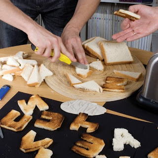
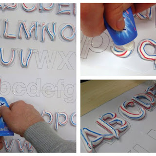
In the weekly email i get off design week, theres this article i found pretty interesting; about how before the digital age, 'type was something physical, chunks of metal you could throw like a rock' etc. And theres various contemporary designers who are keen to make text 3d again, give it some substance and dimension. From top: Vladimir and Maxim Loginov, Maarten Dullemeijer.
Another exhibition i dont have time to go to

Iv read in the latest issue of design week about an exhibition thats just opened at the Victoria and Albert museum, London, showing the history of British stage design and theatrical sets / costumes. It covers 18th century theatre to modern rock concerts stage set ups, the image above is Pete Townsends guitar that he smashed on stage, this image is what drew me to the article, it looks remarkably like a piece im working on for my major project but i swear i did not rob the idea from here!! or anywhere else. But next time im in London ill make an effort to get to this one, could be really interesting.
Sunday, 19 April 2009
Set Design


Since visiting the Container Plus studio in London, iv become interested in the of working in set design. My major project has unintentionally been going this way, and talking to Luise Vormittag has, in my mind, opened up a few possibilities for my work. The idea had never occured to me before, id assosiated set design with some really wierd people doing theatre and earning fuck all money from it. But seeing some of the projects that Container Plus have worked on such as promotional events and launches for companies such as Topshop and MTV, has really inspired me. And then from having looked online, iv realized the opportunities for set design within the TV industry. I remember a show on MTV years ago called headbangers ball, Rob Zombie did the set for that, it was some mental trippy nightmare scene that i cant find to use as an example here, it was mint though.
So basically iv become pretty interested in this, as i think that model making is a skill iv definetly got, and the more iv got into this over the past year, the more iv been kind of dissollusioned , not knowing where my work could fit in, or what it even has to do with illustration anyway. I need to do alot more reasearch into the idea, but for now heres a few examples of some stuff i like, by a company called 3D Creations. Theyve done stage designs for Iron Maiden, who i personally think are shit, but would be an amazing job to have anyway. Other stuff includes sets for museum exhibits, corporate events and launches, channel 4 sets and yes, alot of theatre.
Wednesday, 15 April 2009
Lizards Moving Clip: Manchester Museum
The plan was to do a load of drawings of lizards in motion, as research for the animation im doing. I had underestimated the number of vile children that would be at the museum at 10.00am, totally forgetting its the easter holiday. So i started working, and within five minutes was on the brink of committing murder. So i took this video and left.
Tuesday, 14 April 2009
Circles


 Iv always loved this Bob Dylan poster, it was done by a guy called Martin Sharp at the height of the 60s counter-culture movement. The use of circles is common in psychedelic art both from this time and later, heres a few examples of how modern illustrations have been influenced by this style. The top ones by Matt W Moore and the one under that is by Anna Maria Lopez. Something they all have in common is the use of circles in the design.
Monday, 13 April 2009
Jan Svankmajer
The two links below are animations by the Czech surrealist Jan Svankmeyer. Iv been trying to find examples of 3D animation, cheers eleanor for this one. Its not so much the style i like but the humour & the way he sees things. Its also really well put together, far smoother than anything iv produced so far.
http://www.youtube.com/watch?v=LuBwXfg3Mr4
http://www.youtube.com/watch?v=UQkWrZw05P4&feature=related
http://www.youtube.com/watch?v=LuBwXfg3Mr4
http://www.youtube.com/watch?v=UQkWrZw05P4&feature=related
Monday, 6 April 2009
Moving Theatre : Sharmanka
I found this exhibition in the observer guide to secret britain that i was only reading because i was too hungover to get off the couch. It looks like the most amazing thing ever and i cant wait to see it, shame ill have to trek up to the shithole that is glasgow. Its described as 'a surreal installation about Russian life'. Its a 45 minute kind of theatre style performance:
Hundreds of carved figures and pieces of old scrap perform an incredible choreography to haunting music and synchronised light, telling the funny and tragic stories of the human spirit as it struggles against the relentless circles of life and death.
From the images iv seen its got a pretty dark atmosphere, and theres a bit with Lenin as a paraplegic in a wheelchair. Iv always been really into Russian history, mainly because its so fucked up and wierd, so i definetly have to see this.
|
|
|
|
Sunday, 15 March 2009
MWM Graphics


 I found this work by Matt W Moore on the creative review blog, hes American but his first UK exhibition has just opened at the Concrete Hermit gallery in London, I really hope ill get time to go down to it. I dont think hes been working that long, but already has a massive list of clients. I love it. Id be interested to see how black & white designs like this could look on acetate projected on a wall or something, maybe with different coloured light...
Tuesday, 10 March 2009
British Museum London
While i was in London i made the mistake of visiting Buckingham palace. It was crap. Armed police swarmed around it so i couldnt get anywhere near it and the building itself was nothing special. If i was queen id have a better house than that. So after a dissapointingly short visit to that dump, we noticed signs to the British museum and went there. It was late afternoon so we only had an hour in there, i couldnt believe the size of the place and could have easily spent all day in there, the exhibitions covered all world cultures, displaying various artefacts from the last 2 million years. I found the exhibition on the meaning of life and death in different parts of the world really interesting, it described so many different rituals and beliefs, & there was a piece by an artist whose name iv forgotton, but it was basically a display of a huge number of pills, surrounded by various photos and other personal objects. The idea was to make the viewer consider the number of pills we take in a lifetime, using two different individuals as an example. Visually i didnt find it that exciting but once id read the point of it i spent ages looking at it.
Next time im in London ill definetly go back cos i didnt even see half of it in that hour.
Next time im in London ill definetly go back cos i didnt even see half of it in that hour.
Saturday, 14 February 2009
Tuesday, 3 February 2009

 Ian suggested that i should try using wire to create a similar effect to these pen drawings. Not sure who did them, im sure it would tell me if i read the magazine. I used gauze to make the shape of a cactus & wrapped wire around it, i used a green fairy light inside, its produced an effect that i think could be really interesting when photographed properly. I'll definetly use wire in this way again, trying different colours and experiment with light.
Robert Jacobsen
Tuesday, 27 January 2009
Republican Party Elephant

Illustrator Thomas Fuchs and designer Felix Sockwell have released a whole book of these different representations of the republican party logo. I found it on the creative review blog & iv put them up here because it amazed me how creative you can be with something so simple. I cant pretend to understand every one of them, but i love how they express so many different concepts using the same shape and colours. I guess it just reminds me that communication is often most effective when its kept simple, & also to push myself further when it comes to ideas cos i never thought you could say this much using only a blue and red elephant.
Monday, 26 January 2009
Alan Aldridge Exhibition


 I dragged myself out of bed at 5.30am and spent a total of 11 hours on a bus to see this exhibition at the Design museum, London. Whether it was worth this amount of suffering im not sure, but i definetly enjoyed it and got some inspiration out of it.
The huge cut outs and hanging displays made it unlike any exhibition id ever seen before; it felt almost like entering a whole new world. The Beatles music being played added to the atmosphere. I thought his imagination is fantastic; i particularly liked the odd little creatures he invented for the children's book 'The Butterfly Ball' (Illustrated poems). Its an idea i should consider in the hallucination / paranoia aspect of my major project. Though i generally liked the way the exhibition was laid out, I can definetly see Roger Sabin's point (review, Eye magazine no. 70, p.88) that "the exhibition can feel like a fairground ride at times, and the candyfloss quality of some of the art can lead to a risk of sugar rush".
One large room was covered from floor to ceiling with his album cover designs and illustrations for the Beatles lyrics (of which i bought a book). At first this room looked very impressive, and added to the feeling of stepping into Aldridge's world, but then i realized that I'd actually like to see the stuff that was 20 ft in the air.
I was suprised by how much commercial work hed done - i was unaware that hed designed book and magazine covers and worked in advertising, but one of my favourite pieces on display was a Heineken ad, consisting of two images, the first of a weary, pale looking caterpillar with a full pint of Heineken. The second is an empty glass and the caterpillar has developed fantastic, bright coloured wings. His work for Penguin has inspired my cover design; I loved the contrast between the simple black background and the bright, bold image on the front.
Other exhibits included a car painted with psychedelic designs (I'd love to do this to my car..), but my favourite piece was an animation for 'One of these Days' by Pink Floyd. It felt like driving through a tunnel at night while on acid (not that i have done this) - the walls were covered in wierd and wonderful creatures, and kaleidoscope inspired designs. Though a bit disjointed in places, i loved it and watched it several times.
I like the last line of the review in Eye magazine: Aldridge "sucessfully navigated the tricky terrain between blowing deadlines and blowing minds".
Subscribe to:
Posts (Atom)


